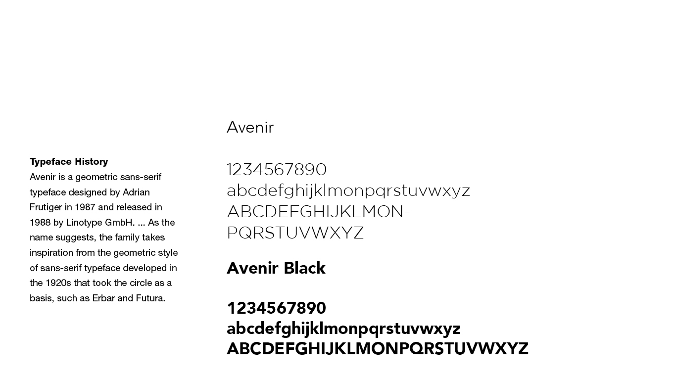
BRAND IDENTITY
BRAND NAMING
DIGITAL STRATEGY
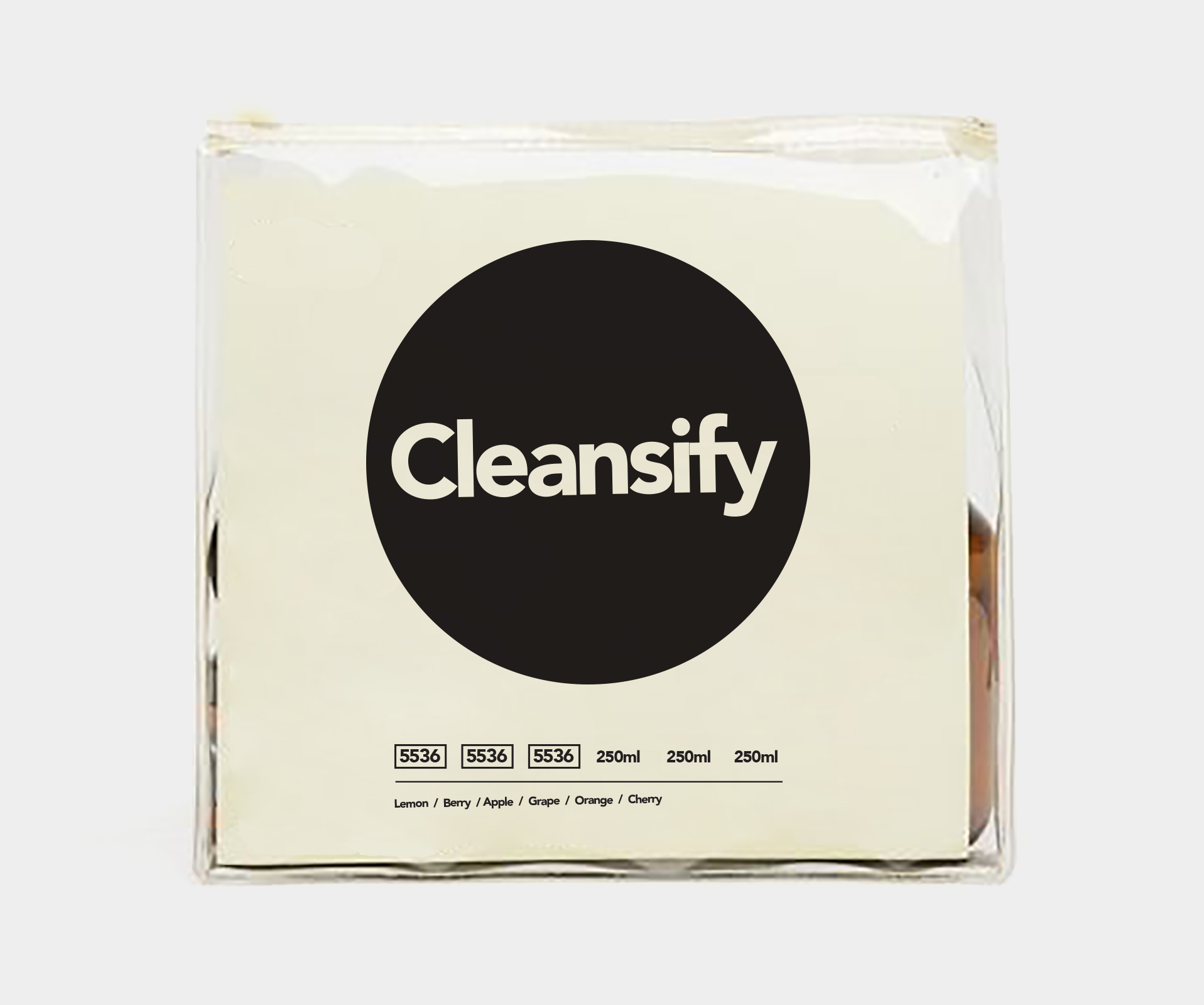
PACKGE DESIGN
ART DIRECTION
CHALLENGE
To most, acne is an annoyance. But skincare products that treat acne shouldn’t harm your body or cause more problems than they solve. This was a belief held by CLEANSIFY, an emerging skincare brand. CLEANSIFY created a lineup of new products that biologically activated the skin’s natural ability to clear acne without damaging skin.For years, consumers were told they needed products full of chemicals like benzoyl peroxide or retinoid to improve their skin, resulting in a lack of innovative or viable solutions. To reframe this perception and position its brand as the healthy solution to acne, CLEANSIFY asked us to help develop a new identity and direct-to-consumer strategy.
APPROACH
Because CLEANSIFY did things differently in the skincare space, we built a brand that was able to be transparent. We established a position that was distinguishable within a saturated category by complementing its brand with a clean personality and expert voice.To activate our refined strategy, we designed the brand to be approachable, friendly, and fresh using a relatable and expressive visual language. We applied this language to various touchpoints, including packaging.