EDITORAL
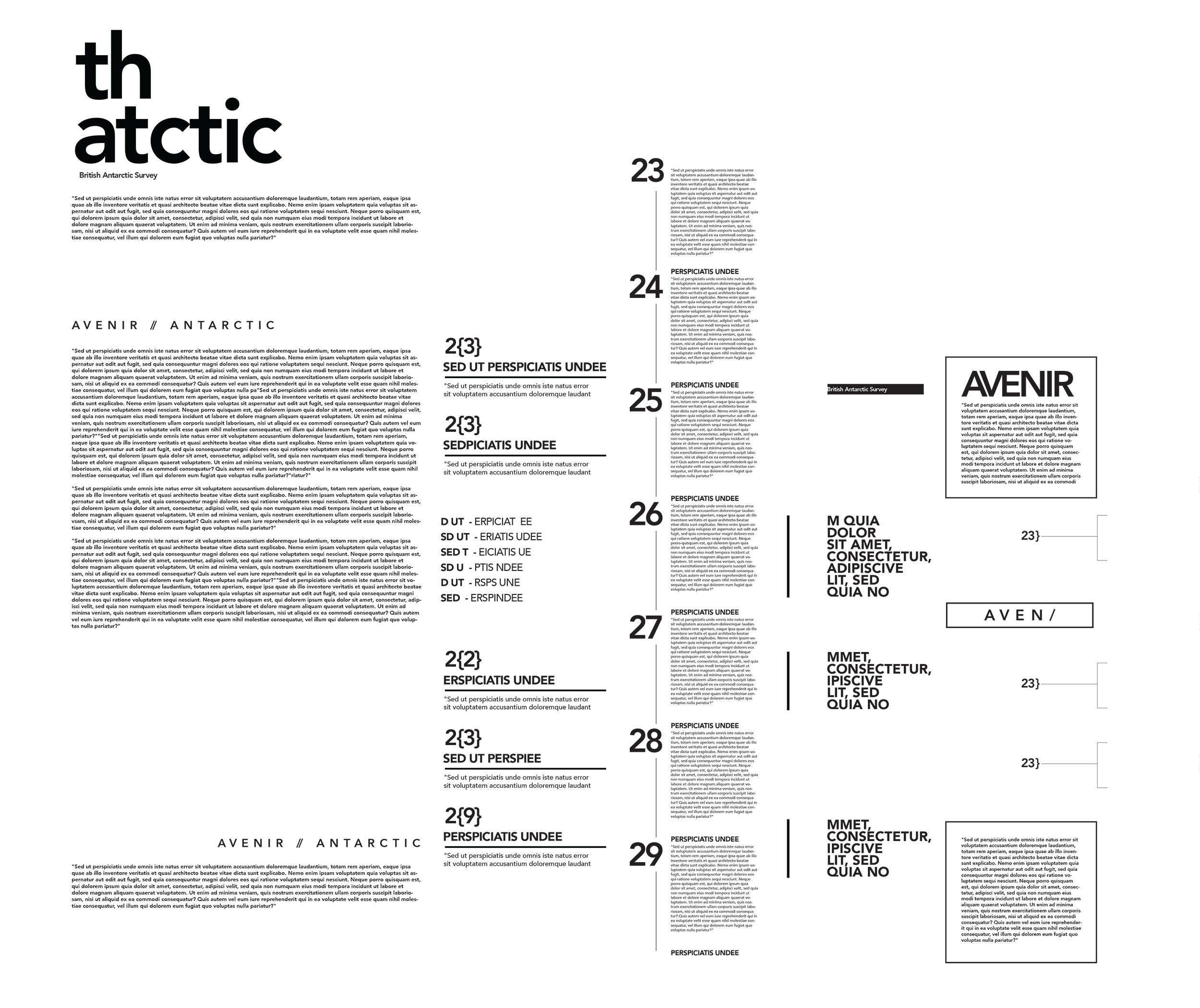
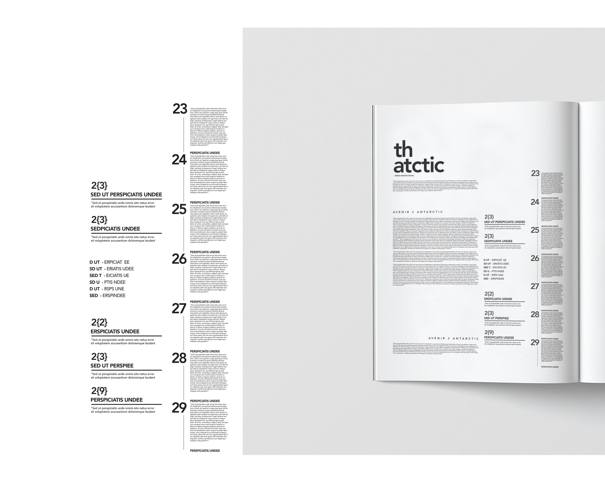
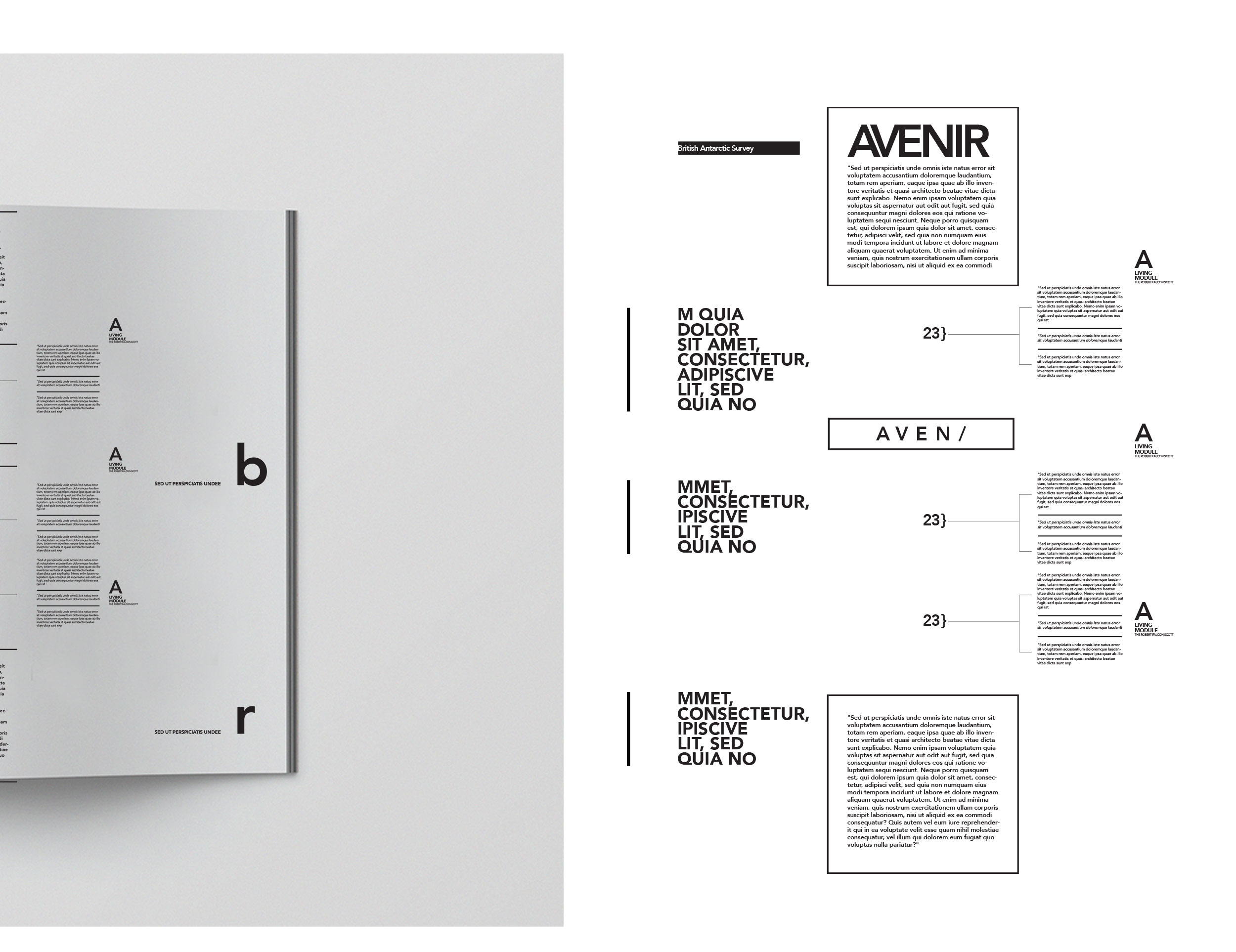
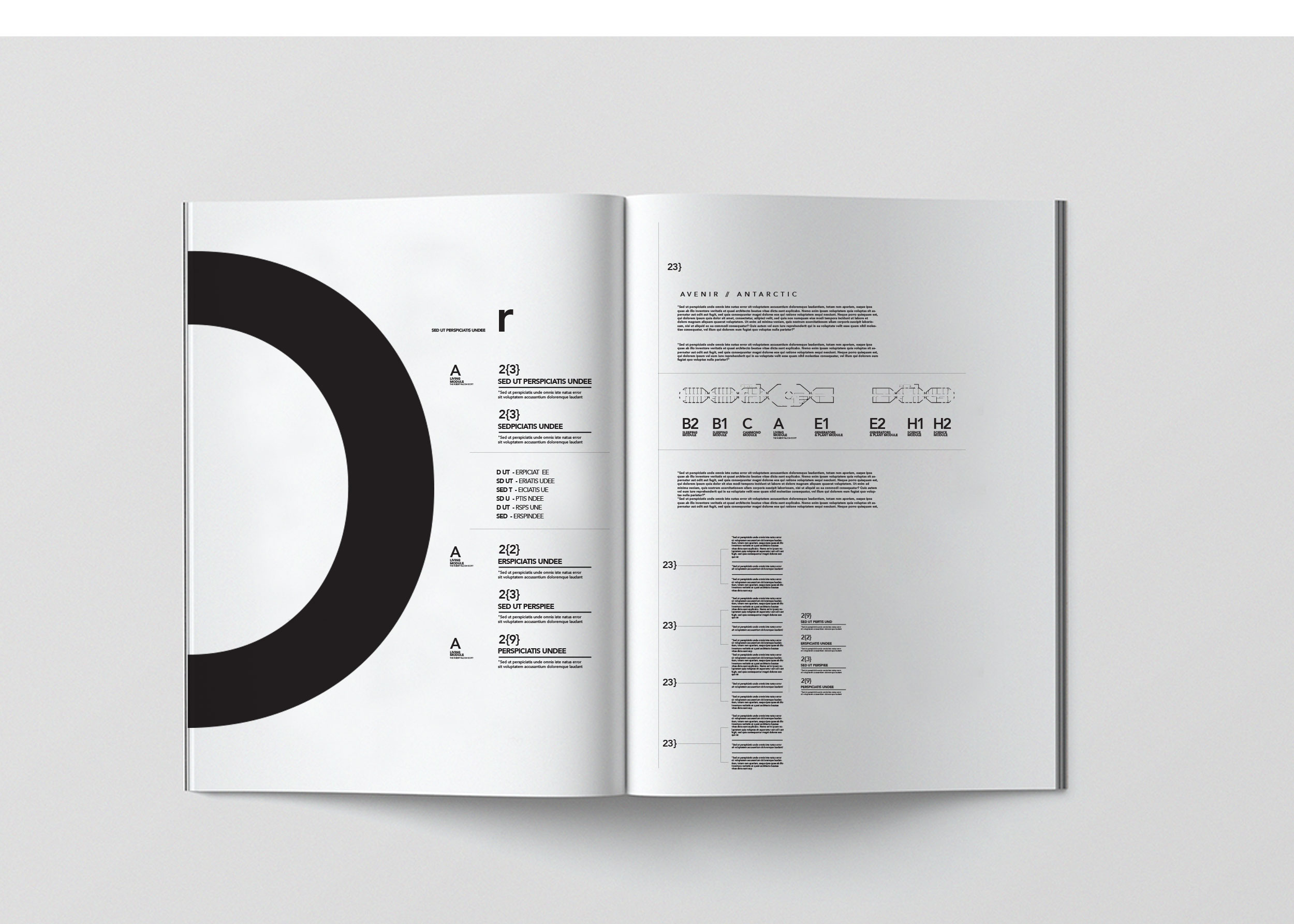
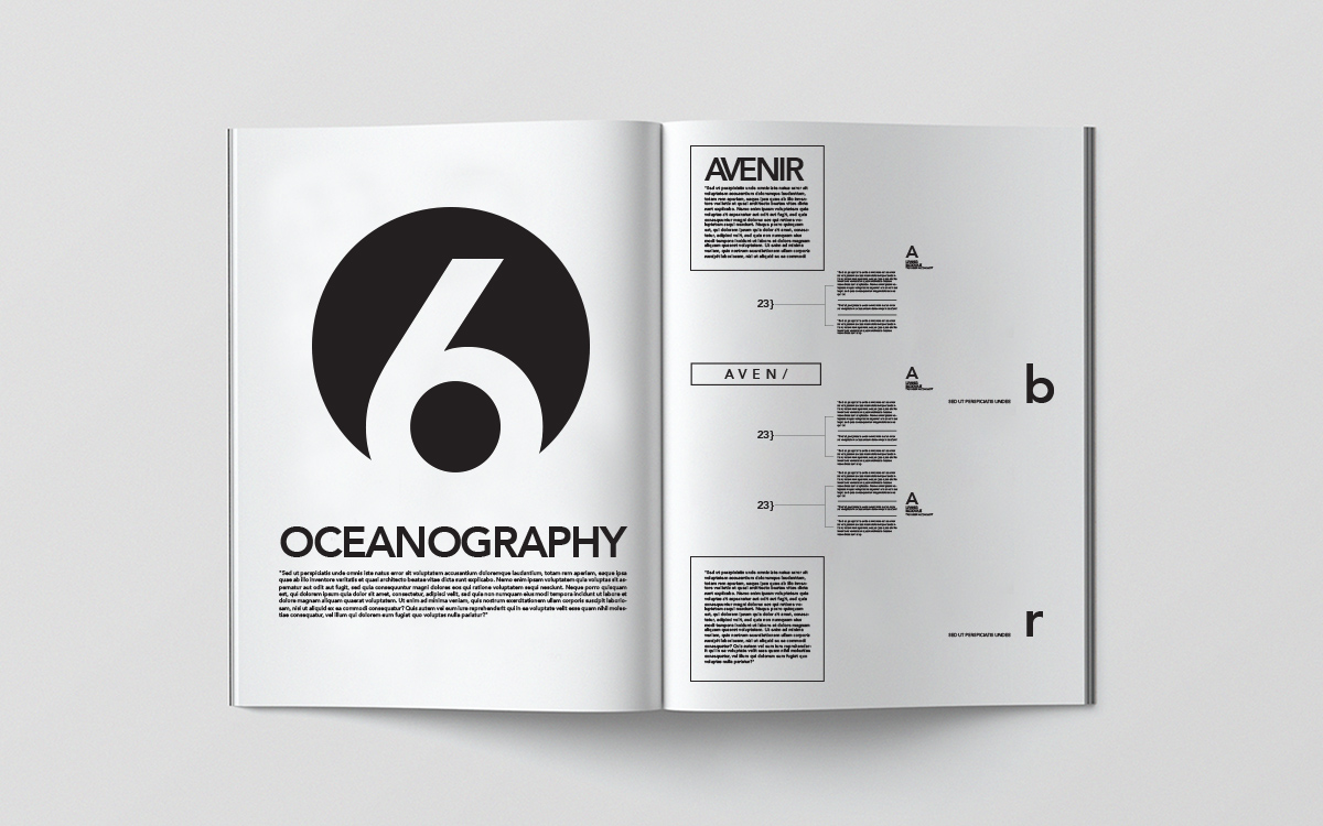
SWISS GRIDS
ART DIRECTION
PROBLEM
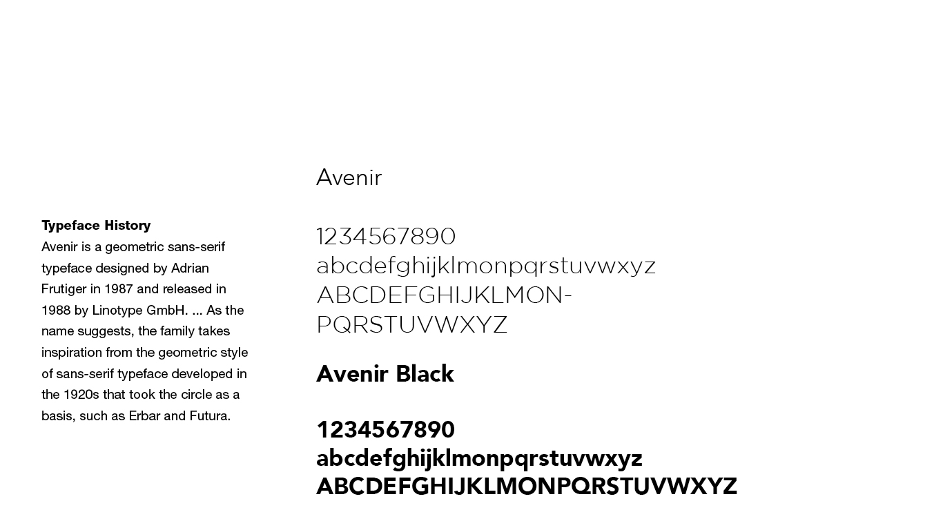
Avenir is one of the strongest fonts that was ever designed. However, this font gets lost with hundreds and thousands of fonts available upon our finger tips. We would like to honor this beautiful font and pay homage to it with a physical package. How would is look like?
SOLUTION
My approach to any Sans Serif font has always been to strategies through Swiss grid systems and direction. I wanted to focus on how the font moves through the letters and how the implementation of a grid layout interacts to its forms the results was then laid out in a physical book.