EDITORAL
SWISS GRIDS
ART DIRECTION
PROBLEM
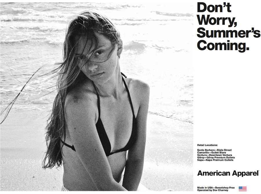
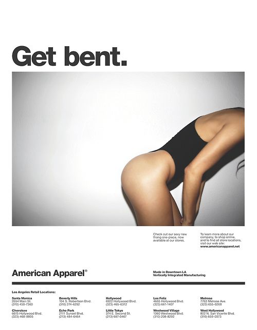
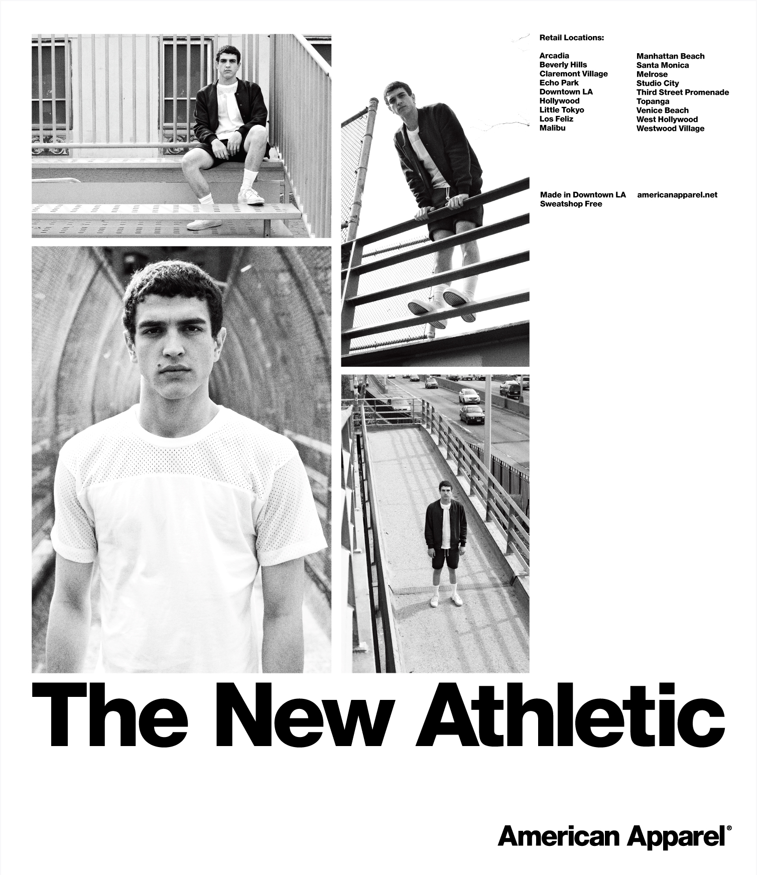
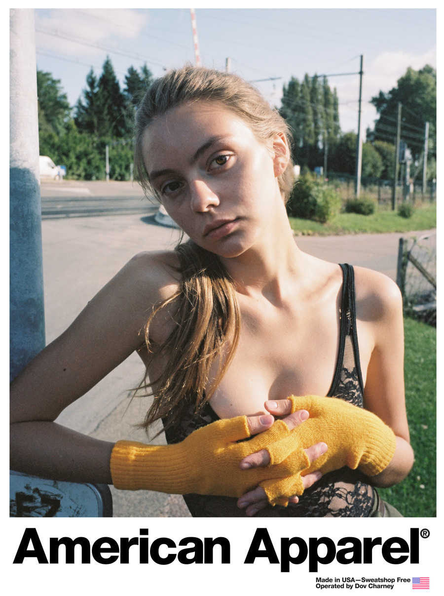
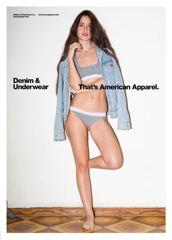
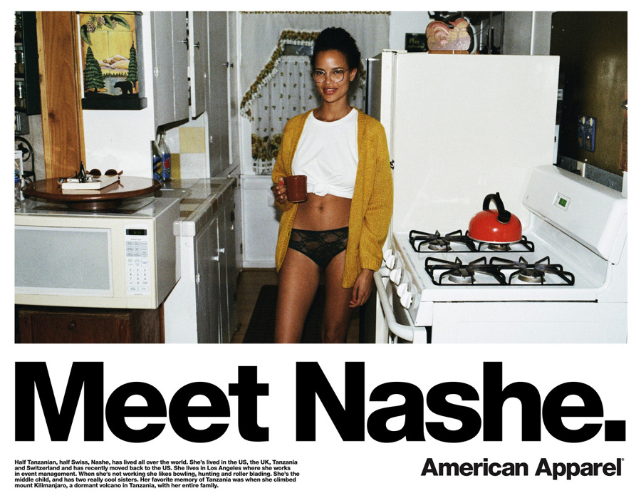
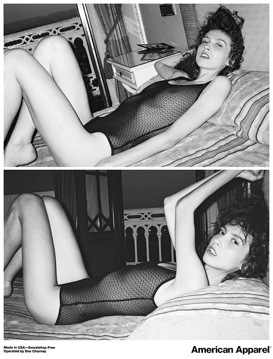
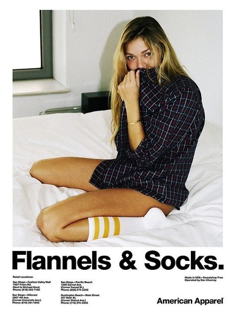
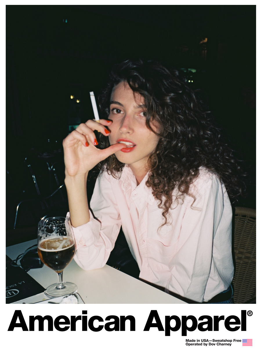
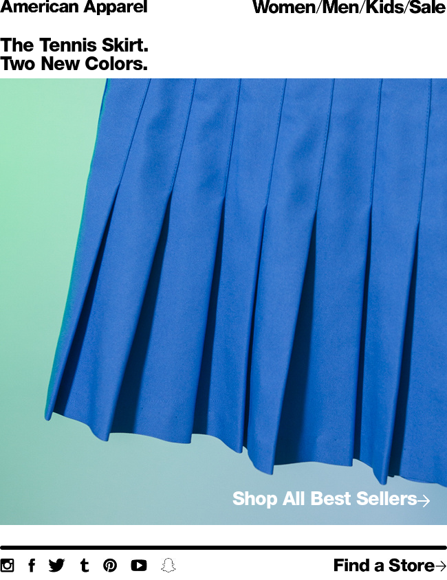
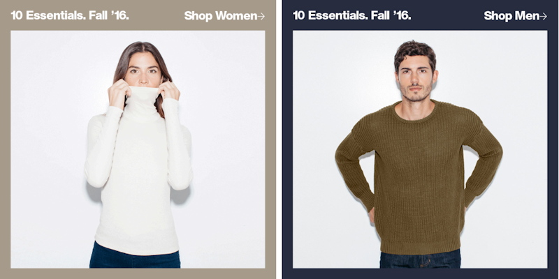
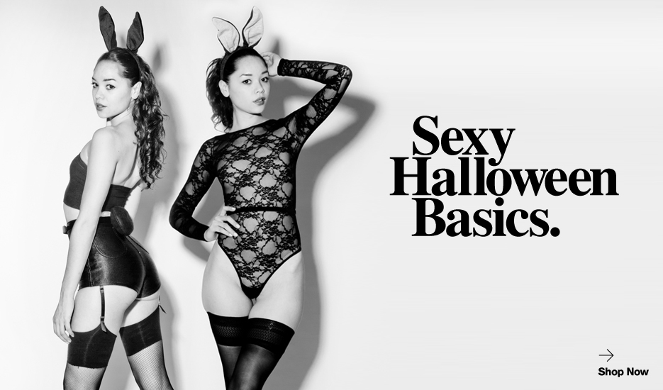
American Apparel is a well recognize and developed brand. They asked me to come in and help production on their advertisements. Sometimes working on the same brand for many years we tend to get burned out. AA wanted to new typographic editorial style layouts that speaks to their brand.
SOLUTION
I came in with little knowledge of their brand but with a little research and art direction strategy, I was able to come up with different Helvetica editorial layouts that speak accordance to their brand. They used these layouts throughout their marketing campaigns including billboards, print ads and email E-Commerce.


